Biggest Farmhouse Style Mistakes
Fair warning we’re about to step on some toes.
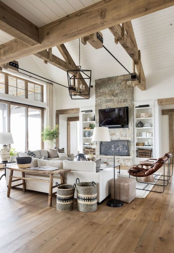
The modern farmhouse style was popularized by none other than the queen of farmhouse style herself, JoAnna Gaines. Fixer Upper taught us all that old can be made new and that charm and character should be put on display. However, many overshoot JoAnna’s sleek lines and worn accents trademark and end up somewhere north of Hobby Lobby.
Ouch right? I know this could get sticky, so if you find yourself guilty in one or many of these farmhouse-style mistakes, don’t worry! I’m here to help you course-correct and walk it back. Hopefully teaching you some of the subtleties that JoAnna is known for so that you can nail the farmhouse style look.
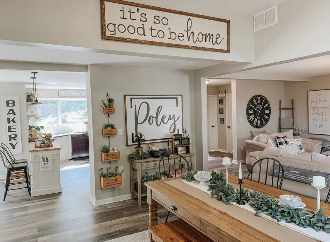
Too many saying signs
Your brain works really hard. Every second your brain is burning fuel to help decipher what information is important and what isn’t. This is a great thing because it helps keep you alive! When we give our brains too much to compute, it gets overloaded and starts to toss the unimportant stuff out.
Design is all about telling your brain what to focus on. Having too many saying signs creates and overload for our brains to read and decipher what is important and what isn’t. What ends up happening is our brains say “too much!” and stop consciously taking in any of it making it appear more cluttered and junky.
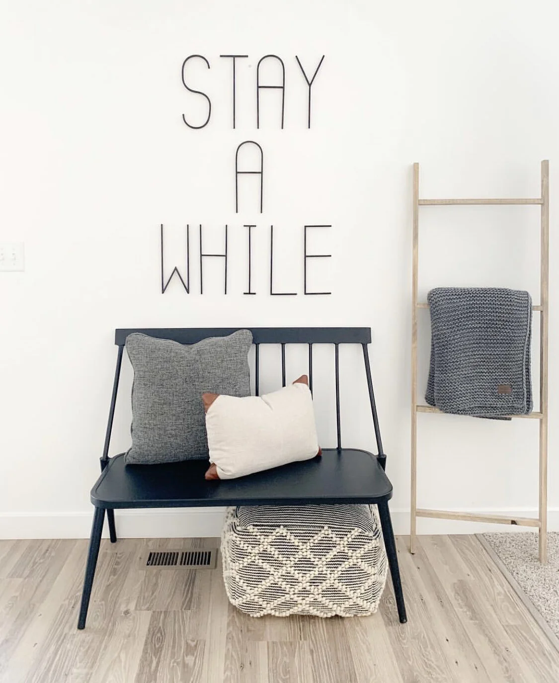
If you’re looking to recreate the saying sign look, try and keep it to one sign per room. Make it a focal point, make it important. Give your brain something it will want to focus on.
Too many knick-knacks
I’m about to step on a soapbox for a moment, forgive me. I see this style mistake all. the. time and it drives me crazy. The farmhouse style is incredibly popular thanks to Fixer Upper, because of that you can find farmhouse style decor virtually everywhere. Because this style is so readily available and incredibly affordable it can be easy to overdo it.
Often times I see spaces layered with farmhouse style decor. Layering in itself isn’t a bad thing, in fact it is a key part of styling a space. However, layering is all about balance. Like I mentioned before, your eyes are taking in a lot of stimuli and your brain is doing the hard work of trying to sort it all out. Often times what you were going for was JoAnna Gaines but what you got was Hobby Lobby.
To undo this farmhouse style mistake, undecorate & simplify. Cut down your farmhouse knick-knacks. Make sure the decor you’re using is the right scale for the space and not too small tempting you to add more items to help increase the visual weight. Cutting down on items and choosing ones of the correct scale for the space will allow your eyes to see visual depth without creating a mental overwhelm.
Not enough blank space
This mistake builds off of the previous one. Because the farmhouse style is so affordable and readily available it can be tempting to cover your home in signs, knick-knacks, metal baskets, ceramic jugs, wooden crates, milk bottles, and greenery.
Almost every client when filling out their project questionnaire lists that they want their space to feel cozy. We love that! Cozy is a part of our name: home + cozy = Homzie. What can happen is that cozy can get replaced with cluttered. It’s a simple enough mistake to make. We often think by having little blank space it will make the room feel warm and inviting.
But in all actuality blank space is your friend! It’s like the margin in a book. If the words went edge to edge it would feel overwhelming. The margin helps make the words on a page manageable to read and gives them a natural frame.
The same can be said of your farmhouse-style decor. By allowing for enough blank space you give your eye enough room to breathe so you can showcase those really special pieces like a vintage dresser that’s been passed down or a unique fireplace design. Let your farmhouse decor breathe so that those special pieces shine through.
Too neutral of a color scheme
Even though this one is last on the list, it is probably the most common farmhouse style mistake I see. Neutrals are the base for almost every farmhouse design, however that doesn’t mean it should stop there. Color adds depth, interest, and focus to a room. Adding color does not have to mean you sacrifice a soft & cozy ambiance either. Too often I see rooms that appear camouflage because they lack any depth of color to grown the space and give the eye something to focus on.
I know what you’re thinking, “But JoAnna always has neutral colored spaces.” And this is where I kindly and gently tell you you’re wrong. She never has entirely neutral spaces, never. Don’t believe me? I’ll link to a round up of Fixer Upper rooms for you to see for yourself. She is a color master! Bringing in natural, not just neutral, colors into a space. Greens, blues, deep oranges and yellows dot her designs like visual candy. It is the colors in the space that help create warmth, balance, and that soft ambiance farmhouse style lovers are craving.
To course-correct your neutral color scheme, try adding greens & blues to start. Add a colorful accent pillow, chair, rug, plant, or accessory to a space and begin building in a depth of color into your neutral space.
Work 1:1 With One Of Our Expert Virtual Interior Designers
Work with a Homzie virtual interior designer to create a customized shoppable design plan tailored to your needs, style, and budget. All for a low flat-room rate.


