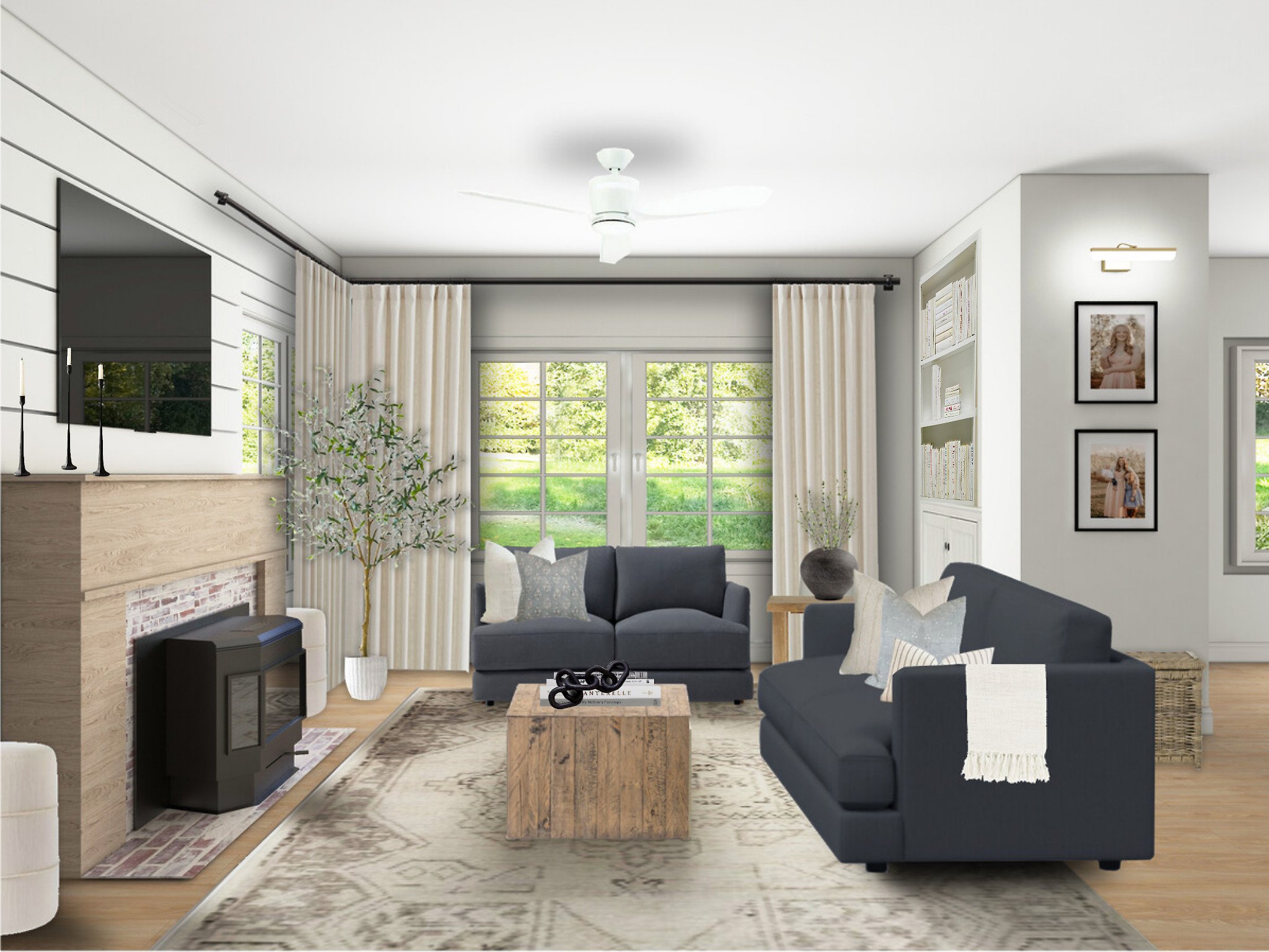
5 Interior Design Mistakes To Avoid
Source: Chris Loves Julia
When it comes to interior design, there are common home decorating mistakes that we often see. Avoiding interior design mistakes is important to ensure that your space looks cohesive and functional. One of the key things to keep in mind is to have a clear plan before you start decorating. This includes setting a budget, determining your style, and creating a functional layout for the room. It's important to avoid overcrowding the space with too many pieces of furniture or decor. Instead, focus on selecting a few statement pieces that will enhance the overall aesthetic. Additionally, make sure to pay attention to lighting, as proper lighting can make a big difference in the feel of a room. Lastly, don't be afraid to ask for help from a professional interior designer if you need it. Below are five of the most common home decorating mistakes that you should try to avoid.
Source: Jenna Sue Design
Hanging Curtains The Wrong Way
Hanging curtains may seem like a simple task, but this is one of the most common home decorating mistakes we see! Hanging curtains the right way can be summed up this way “high and wide.” When hung properly curtains give the illusion that your ceilings are higher and your space is larger. You can easily hang your curtains like a pro by following these 3 easy steps:
Hang Curtains High
Hang Curtains Wide
Select The Correct Length For Your Curtain Panels
For more detailed information on how to properly hang curtains in your space check out this blog post, or view this reel.
Source: Studio McGee
2. Not Emphasizing The Focal Point
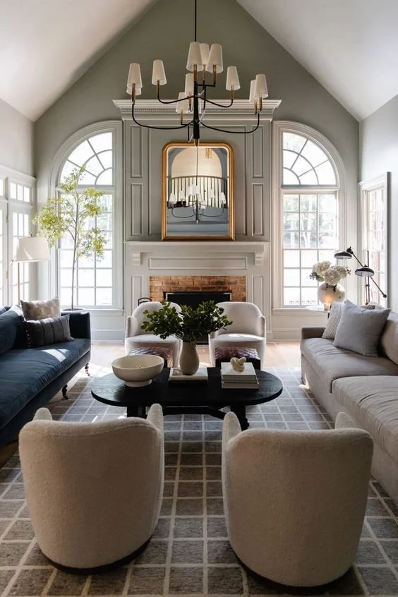
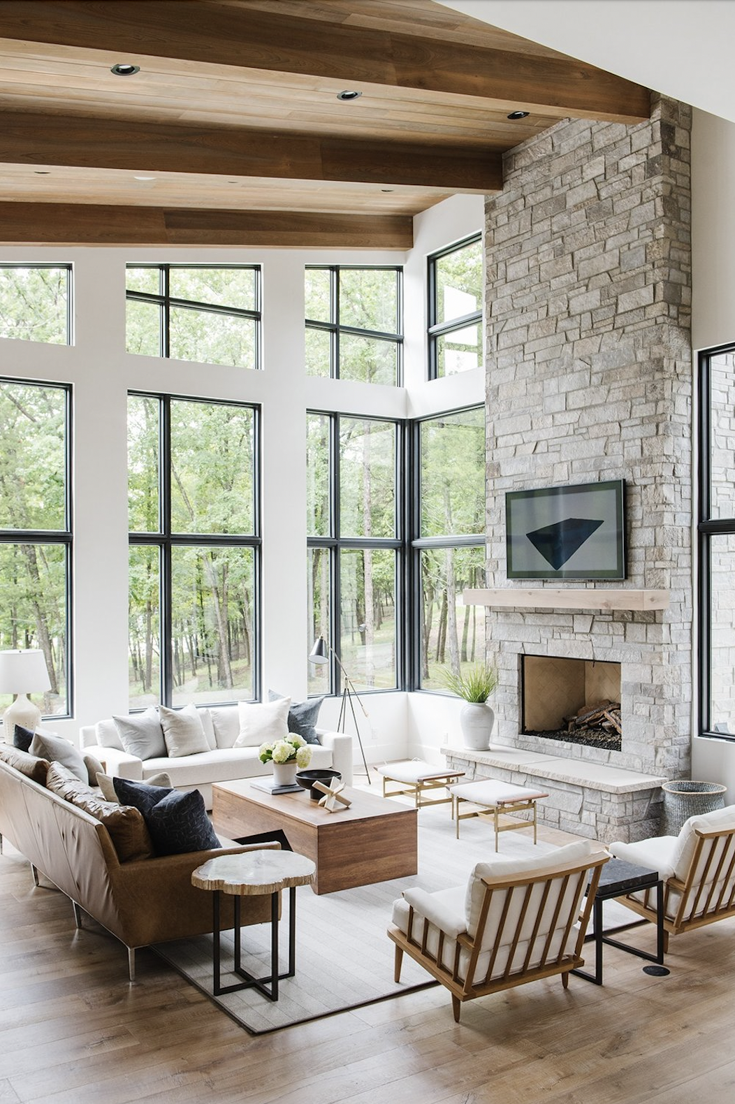
Do you feel like your space doesn't feel pulled together? It is likely because there isn't one clear focal point. Nothing will make sense in your space until you create proper emphasis around the focal point. The focal point is the most important element that anchors the design and adds interest. The purpose of a focal point is to tell our brains where to look first. If it's not 100% clear where your eye is telling you to look within about ½ a second you need to use one of the design elements listed below to add interest. Here are 8 ways to add emphasis and to help make it clear exactly where you should look first in your space
Furniture Groupings
Architectural Features
Color
Size
Lines
Lighting
Pattern
Accessories
For more detailed information on how to properly emphasize and create a focal point in your space check out this blog post, or view this reel.
Source: Jane At Home
3. Choosing The Wrong Size Rug
We often see clients selecting rugs that are the wrong size for their space. While it can be tempting to save a few dollars by purchasing a smaller rug, the impact it makes on the function of your space and overall design aesthetic isn’t really worth it. A rug that is too small can make the room feel incomplete and disconnected. On the other hand, a rug that is too large can overwhelm the space and make it feel cramped. The right size rug should anchor the room and create a cohesive and welcoming atmosphere. Once you have the right size, you need to make sure it’s placed at the correct spot in the room to allow for maximum functionality and impact! This guide will tell you exactly how to select the right size rug for your space.
Source: Homzie
4. Hanging The Wrong Size Wall Art
We often get asked, “how do I know what size art to hang over my ____?” The short answer is proportion is key! As they say, size isn’t the only thing that matters. Selecting the right type of art or decor to go in your space can make as much of a difference aesthetically as the size can.
Here are three key tips to remember when hanging art:
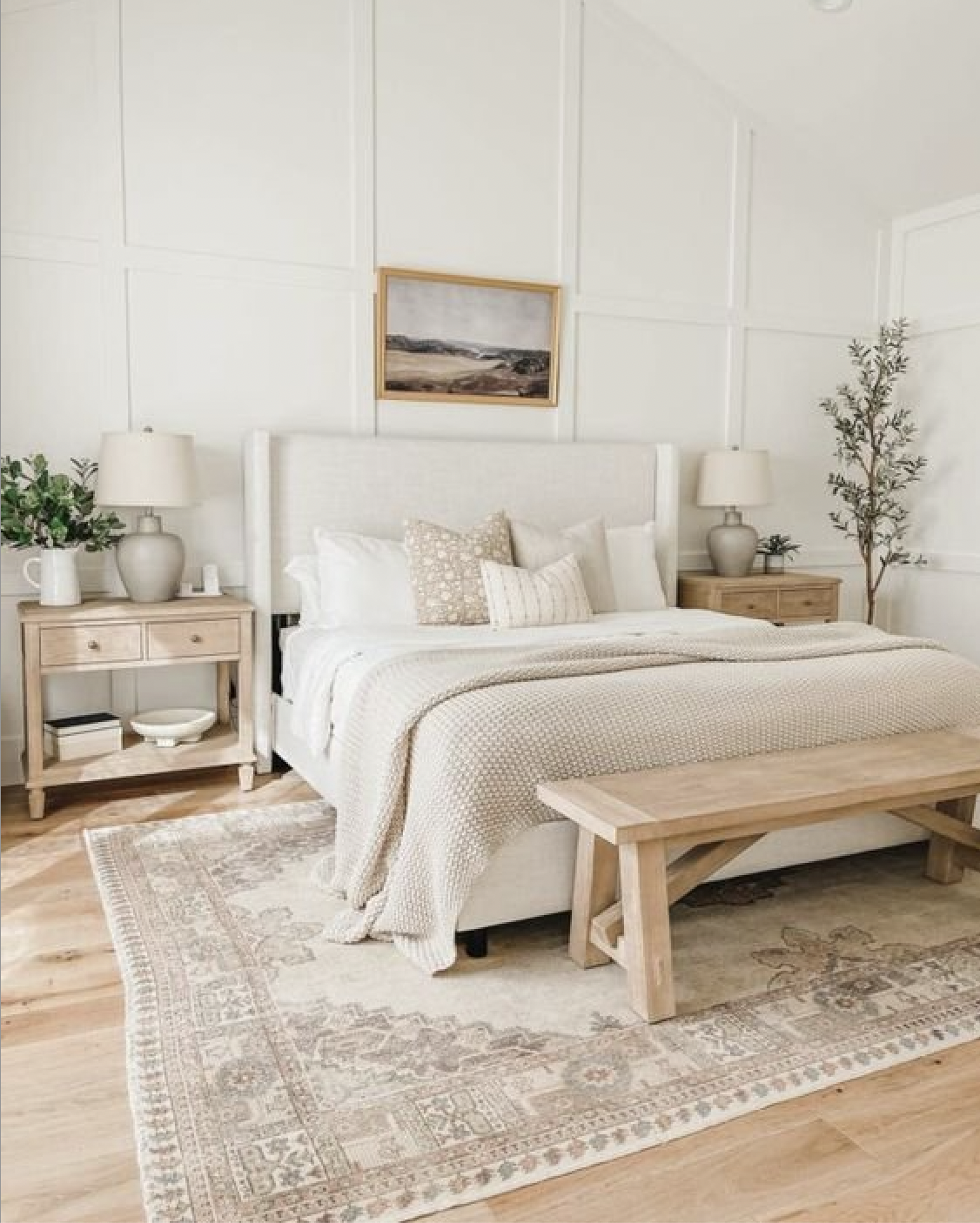
When hanging art on a blank wall, your wall art should take up about 60-75% of the wall space.
When hanging art on an empty wall, the mid-point of your art should be between 57 - 60.”
When hanging art above a sofa, console table or any other surface you will want to hang the art so that the bottom of the art or frame is 6-10” above the top of the surface.
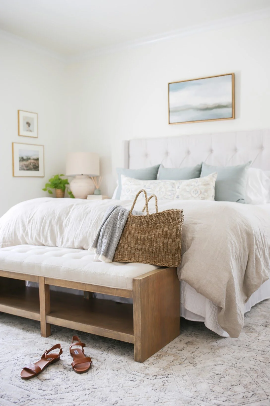
We created a guide for selecting the right size art to hang over a queen, king, or twin-sized bed.
We also created this reel to show you exactly what size art should be hung above your sofa.
5. Not Having A Cohesive Color Palette
Having a cohesive color palette in your home creates a sense of harmony and balance throughout the space. When colors complement each other, they work together to create a cohesive and visually appealing atmosphere. Additionally, a cohesive color palette can make a small space feel larger and a large space feel more intimate. It also allows for easier coordination of furniture and decor, as everything will work together seamlessly. A consistent color scheme can increase the overall value and appeal of your home, as it creates a polished and put-together look.
To learn exactly how to create a cohesive color palette in your home check out this blog post or view this reel.
To learn how to select the right paint color for your space read this!
Work 1:1 With One Of Our Expert Virtual Interior Designers
Work with a Homzie virtual interior designer to create a customized shoppable design plan tailored to your needs, style, and budget. All for a low flat-room rate.

